Michelangelus|exe
A new typeface bears the Renaissance genius’s name and turns his handwriting into a digital tool. The next time you choose a typeface for a document, you’ll be able to choose Michelangelo.
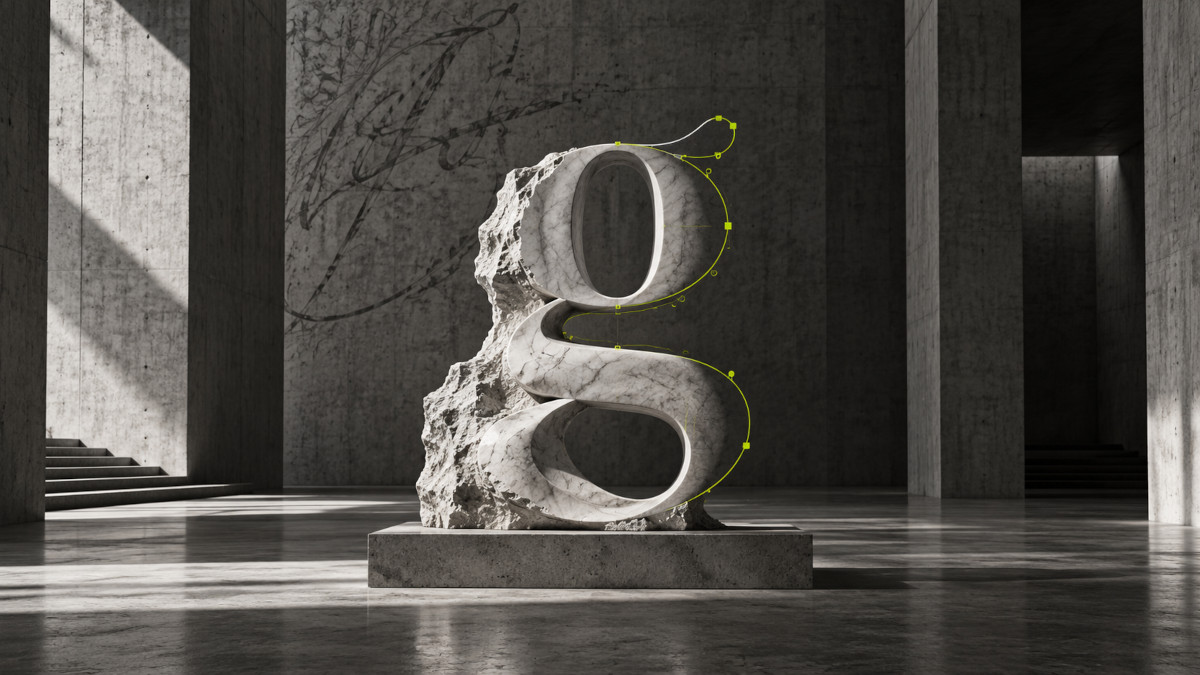
This is no metaphor. Michelangelus is a new type family inspired by the handwriting of Michelangelo Buonarroti, designed by the Italian-German studio studiogusto® on commission from the Fabbrica di San Pietro, the institution responsible for preserving St. Peter’s Basilica in the Vatican. Microsoft contributed to its technical development and is incorporating it into its digital ecosystem. The announcement came on October 8, as part of the celebrations marking 400 years since the basilica’s consecration.
I find the news deeply moving. One of the artists of the fifteenth and sixteenth centuries who best understood the physical weight of form now inspires a tool we use to write, present ideas and work in the twenty-first century. Somewhere between the two lies a question: what does it mean to translate a historical work into another language without stripping it of its identity?
Form as a starting point
Michelangelo needs little introduction. David, the Pietà and the frescoes of the Sistine Chapel belong to that small group of images that seem to have always existed in our memory, even for those who have never stood before them. His influence extends beyond art history: he changed how the human body was represented, how the relationship between figure and space was conceived, and how the expressive capacity of matter was understood.
In his sculptures, the body seems to contain an energy about to be released. In his paintings, figures twist, advance and confront one another. There is no decorative stillness. There is tension, anatomy, volume. And a spatial intelligence capable of arranging hundreds of bodies without diminishing the power of any one of them.
That sense of form is also the starting point for Michelangelus.
From handwriting to an alphabet
The project did not set out to reproduce the artist’s handwriting as one might turn a signature into a graphic effect. The team studied letters, notes and signatures preserved in the archives of the Fabbrica di San Pietro, the Vatican Apostolic Archive and Casa Buonarroti in Florence. It examined slants, proportions, stroke endings, rhythms and empty spaces. The lowercase letters were strongly influenced by his manuscripts; the capitals, by contrast, evoke the monumental dimension of his work.
I find that distinction very important. Personal handwriting can be irregular, hurried, even difficult to read. A typeface, however, has to function as a system: each letter must coexist with the others, recur and maintain a recognizable identity. The task was to identify what remained consistent in Michelangelo’s gestures and translate it into an alphabet capable of circulating in the contemporary world.
The team began with the italic, because handwriting of the period was rooted in a slanted calligraphic tradition. And it spent a week refining a single letter: the lowercase g. One letter. Days of work to balance the character of a historical stroke with the demands of a contemporary typeface. This is about more than drawing inspiration from an artist; it means truly studying his language.
It also reveals something about Michelangelo himself. Handwriting was no minor concern for him. In a letter to his nephew Lionardo, he complained about how difficult he found his messages to read and urged him to take greater care. Legibility, it seems, could drive him to distraction too.
In December 1563, Michelangelo wrote to his nephew that his hand could no longer serve him in answering letters. Writing was becoming difficult. Four and a half centuries later, that same handwritten trace, then losing its strength, inspires a typeface intended to circulate across millions of screens.
From gesture to a digital system
I am interested in considering this transformation through the lens of digital art. Not because a typeface is necessarily a work of digital art, but because the project follows a logic characteristic of our time: it takes a material archive, analyzes it, identifies structures and transforms them into a reproducible system. The gesture of the hand becomes a vector drawing. Ink becomes mathematical outlines. A letter becomes a unit that can be enlarged, reduced and displayed on thousands of screens without losing its essential features.
Here, technology does not replace history. It gives it another field in which to circulate.
Space is part of the design too
There is also an evident connection with sculpture. Michelangelo worked with volume, but also with what surrounds it. The gap between an arm and a torso, the distance between two figures, the way a curve changes our perception of a body. Something similar happens in typography: a letter is defined not only by its outline, but also by the space it leaves around itself and the relationship it establishes with the next letter. White space is not a leftover. It is part of the design.
In painting, sculpture and typography, form depends on precise relationships. The differences lie in material, scale and medium. Marble imposes its resistance; fresco, the conditions of architecture; a digital font, the rules of a technical system. Each language calls for different decisions, even as certain questions persist.
A new way for heritage to circulate
Michelangelus includes more than 500 glyphs, according to information released by the Fabbrica di San Pietro, and offers four styles: regular, italic, bold and bold italic. It is free to download and designed for documents, publications and digital applications. Its arrival in Microsoft 365 will extend its reach far beyond the specialized world of design.
The world’s artistic heritage does not have to remain motionless to retain its value. It can be studied, reinterpreted and brought into contact with new technologies, provided the process understands the essence of what it takes as its starting point.
Michelangelo used his talent to reveal beauty, express his vision of the world, draw closer to God and explore the limits of human capability.
May whatever is written in Michelangelus not disappoint him.